Organic earthy website design, the slow stack.
Cream paper bases, moss and terracotta palettes, editorial serifs, hand-torn edges, biophilic touches and deliberate negative space. A style guide for wellness, organic skincare, sustainability brands and slow-living publications, with every swatch checked for contrast.
On this page
Earthy website design is the warm, editorial style built on a cream paper base, moss, sage and terracotta accents, walnut ink and generous negative space. It suits wellness, skincare, natural food, sustainability and craft brands. The fact that matters: walnut on cream measures 11.09:1 contrast, while moss on cream measures 2.57:1, so moss is for fills, never body copy.
The slow-living visual language of sustainability brands.
Organic earthy design is the slow-living visual language of patagonia.com, kinfolk.com and sezane.com. Cream paper replaces white, walnut replaces black, moss and sage carry the brand, and one terracotta accent per screen does the pointing. Editorial serifs sit over a humanist sans, and the layout leaves room to breathe.
Kinfolk magazine, a lifestyle title since 2011, showed what an unhurried editorial layout looks like on a screen. Our Place and Sézane wanted the same tactile warmth on their own storefronts.
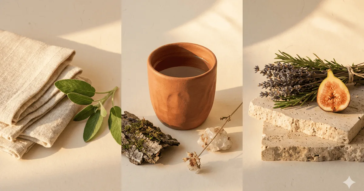
The aesthetic borrows from biophilic design, the architectural argument that people respond well to natural materials, plants and daylight indoors. On a web page that becomes raw linen backdrops, a single leaf, a ceramic vessel, and photography shot in warm daylight rather than under a studio sweep.
A note on bias. Digital Heroes borrowed this vocabulary for its own site: the moss accent, the italic Instrument Serif, the editorial spacing, set on a dark base rather than cream. We did not invent the style. We adopted it because it does positioning work that a purely functional interface cannot. Half of this page is about when it is the wrong choice.
Five live sites running the earthy editorial look.
The fastest way to internalize the style is an hour on the sites that shaped it. The five below cover the full vocabulary: outdoor sustainability anchor, French fashion warmth, modern kitchen DTC, slow-living publication and a design feed. Open them on a desktop. Notice the cream paper, the editorial line breaks and the absence of carousels.
- patagonia.com · the sustainability anchor. Editorial product pages built like field reports, type that reads as an outdoor catalogue, a palette pulled from rock and granite. The reference for any brand whose story involves real outdoor use rather than aesthetics alone.
- sezane.com · the Parisian DTC fashion brand, as General Atlantic describes it. Editorial photography, generous gutters, restrained product grids.
- fromourplace.com · the Always Pan brand. Cream backgrounds, terracotta and sage product photography, hand-drawn illustration accents, editorial product copy. A kitchen storyteller that happens to sell cookware.
- kinfolk.com · the slow-living publication that codified the editorial side. Long-form articles, fine type, considered photography, near-zero ornament. The grammar book for every site in this category.
- designboom · the long-running design publication that catalogues the wider biophilic and craft movement. Useful as a feed of brands trying cream paper, raw textures and natural materials in commercial layouts.
What none of them share: pure white backgrounds, neon accents, glassmorphism, 3D illustration or carousel-stuffed homepages. The style is what is left after you remove every soft-tech convention.
Six swatches pulled from soil, leaf and clay, each checked for contrast.
The palette is six swatches and no more. Moss green carries identity, sage softens surfaces, one terracotta accent per screen points at the action, cream paper replaces white as the canvas, walnut replaces black as the ink, and olive is the structural neutral. Every pair below was measured against the WCAG 2.2 contrast formula.
| swatch | name | hex | role | on cream |
|---|---|---|---|---|
| Moss green | #6fa37a | brand primary | 2.57:1, fills only | |
| Sage | #b5c4a0 | soft secondary | 1.63:1, surfaces only | |
| Terracotta | #c2693d | single warm accent | 3.44:1, large text and UI | |
| Cream paper | #f5f0e8 | canvas / surface | canvas | |
| Walnut | #4a2c1d | ink / display type | 11.09:1, AAA | |
| Olive | #5d6b3a | structural neutral | 5.10:1, AA |
The ratios come from the WCAG 2.2 contrast minimum formula, the same one our free color contrast checker runs. AA asks for 4.5:1 on normal text and 3:1 on large text and interface parts. Only walnut and olive clear 4.5:1 on cream, so body copy is walnut and secondary text is olive.
The consequence most earthy sites miss: a moss button with cream text measures 2.57:1 and fails. The same button with walnut text measures 4.31:1 and passes AA for normal text. Olive with cream text measures 5.10:1 and passes too. We checked every pair before shipping this page, and the AI prompt below carries the correction.
Building your own version? Pull the swatches from a photo of linen, clay or bark with the palette extractor, or start from a seed with the palette generator. Either way, no pure black, no pure white, no neon, no gradient blue. The discipline is in what you refuse to add.
Three faces, all free on Google Fonts.
The typography pairing is short and warm. A humanist sans for body at 16 to 18 px with generous line height: Inter, free on Google Fonts. An editorial serif for display: Source Serif 4 sits closest to Tiempos Headline without a licence. A mono utility face, used sparingly, for captions and metadata. Three faces total. Anything more reads as indecision.
| role | typeface | weight / style | source |
|---|---|---|---|
| body | Inter | Regular 400 / Medium 500 | Google Fonts |
| display | Source Serif 4 | Regular 400 / Semibold 600 / Italic | Google Fonts |
| captions / mono | JetBrains Mono | Regular 400 | Google Fonts |
| body alt | Source Serif 4 | Regular 400 | Google Fonts |
Premium licensed faces (Söhne, Tiempos Headline, Editorial New) sharpen the result if the budget exists. The free pairing above gets a brand most of the way at zero typeface cost, which is usually enough to ship and decide later whether to upgrade.
Organic earthy UI patterns for 2026.
Organic earthy UI patterns in 2026 are quiet by rule. Buttons are calm rounded rectangles, cards sit on sage or cream panels with no drop shadow, dividers are hairline olive rules or torn paper edges, and texture comes from a film grain overlay at 8 to 12 percent opacity. Nothing glows, nothing floats, nothing autoplays.
Buttons and links.
- Primary button: moss fill with walnut text (4.31:1), or olive fill with cream text (5.10:1). Never moss with cream text.
- Hover darkens the fill one step. No glow, no gradient, no lift.
- Text links underline in olive at 40 percent opacity, walnut on hover.
Cards and panels.
- Sage panels on the cream canvas, a 1 px olive border at 30 percent, radius 12 to 16 px.
- No drop shadow. Depth comes from the paper tone, not from blur.
- One hand-torn edge per page at most, low contrast, never on a form.
Texture and edges.
- Film grain across the canvas at 8 to 12 percent opacity, pointer events off.
- Hand-drawn underlines and arrows in walnut, one stroke weight.
- No glass blur, no neumorphic insets, no 3D clay renders.
Imagery and props.
- Warm daylight, linen or cream backdrops, product on travertine or wood, never a white sweep.
- One natural prop per section: a leaf, a stone, a ceramic vessel, a sprig of dried herbs.
- Illustration is hand-drawn line work, not vector blobs.
Motion.
- One gentle background drift at most, and scroll reveals that respect prefers-reduced-motion.
- No parallax layers, no scroll-jacking, no autoplaying carousels.
- Transitions at 200 to 300 ms with an ease-out curve. Slow tempo, not slow pages.
Forms and navigation.
- Inputs with an olive border on cream, walnut text, a terracotta focus ring.
- A short nav with a serif wordmark. No mega menus, no sticky promo bar, no countdown timer.
- Footer in walnut on sage, with the newsletter form as a single calm line.
The sibling styles differ by one rule each. Japandi swaps cream for white and oak and drops the grain. Editorial Kinfolk keeps the serif and removes the props. Noise and grain keeps the texture and lets the palette go anywhere.
When earthy website design is the right call. And when it backfires.
This style is a positioning move first and an aesthetic second. It works when the brand needs to read as calm, considered, natural or sustainability-aligned. It damages brands that need to read as fast, urgent or tightly engineered. Six archetypes where it fits, three where it does not, and one honest test.
Where earthy works.
- Wellness and skincare brands · the palette pre-sells "natural ingredients" before the ingredient list is read.
- Organic and natural-food brands · cream paper and editorial serifs read as farm rather than factory.
- Sustainability and regenerative agriculture · the aesthetic does positioning work the copy then confirms.
- Slow-living publications and editorial sites · the style is the genre signal.
- Indie ceramics and craft studios · the tactile palette mirrors the handmade product.
- Agencies leaning editorial · the right register for a studio that wants to read as considered. Hi from us.
Where it damages the brand.
- Tech and SaaS dashboards · engineers expect a tight grid with high information density. Soft cream paper reads as unserious to technical buyers.
- High-energy Gen-Z fashion · the entire pitch is urgency and saturation. Earthy palettes read as muted there, and muted is the opposite of the brief.
- Urgent-CTA funnels · limited-time drops and flash sales. The calm tone slows the click; visitors browse rather than buy.
The pattern: if the visitor needs to feel rushed, do not use this style. If they need to feel reassured, it is often the only style that does the job in one scroll.
The honest test: read your hero copy aloud. If it ends with "shop the drop" or "limited time," pick a higher-energy style. If it ends with "made carefully" or "designed to last," this is the right one.
What an earthy brand designer actually delivers.
An earthy brand designer delivers a system, not a mood board: a palette with a contrast verdict for every text and background pair, a two or three face type pairing with sizes, texture rules, photography direction, and theme tokens so the look survives the Shopify or WordPress build. Ask for all five before you sign.
- A measured palette: six swatches at most, each text and background pair checked against WCAG AA, with the failing pairs named so nobody ships cream text on moss.
- A type pairing with numbers: faces, weights, sizes and line heights for body, display and captions, licensed or free, so the developer never guesses.
- Texture rules: grain opacity, where a torn edge may appear, and the one hand-drawn stroke weight. Without a ceiling, texture creeps until the site reads as a scrapbook.
- Photography direction: daylight, backdrops, props and crop ratios, written down for the next shoot as well as the first one.
- Theme tokens: the palette and type as CSS variables or Shopify theme settings, so the build inherits the system instead of approximating it.
At Digital Heroes the brand identity work and the web design or Shopify build come from the same agency, and a written scope arrives within 48 hours of a call. Skincare, coffee and wellness brands are the archetypes this look fits; our DTC skincare, craft coffee roaster and wellness supplement archetype case studies cover the commercial work that follows the design.
One copy-paste prompt for Midjourney, Nano Banana, or v0.
The prompt below is tuned for image models (Midjourney, Google Nano Banana) and code models (v0.dev, Claude Artifacts). It pins the constraints the style depends on: cream paper base, moss and terracotta palette, editorial serifs, hand-drawn elements, generous negative space, no neon, no 3D, no slick polish. It also carries the contrast correction from the palette table.
Paste it into your tool of choice. The default output will often lean too clean and too templated. The "no slick polish" closing line is what keeps it honest. If you want a fully editorial result with no commercial gloss, add "treat this as the cover of a slow-living publication, not a DTC storefront" at the end.
Generate an organic earthy landing page for a [BRAND NAME /
ONE-LINE DESCRIPTION] in the [WELLNESS / ORGANIC SKINCARE / NATURAL FOOD /
SUSTAINABILITY / INDIE CERAMICS / SLOW-LIVING PUBLICATION] category.

PALETTE (strict, pulled from soil, leaf, and clay):
- canvas: cream paper #f5f0e8 (replaces pure white)
- ink: warm walnut #4a2c1d (replaces pure black; 11.09:1 on cream)
- brand primary: moss green #6fa37a (fills and marks only, never text on cream)
- soft secondary: sage #b5c4a0 (surfaces only)
- single warm accent (one per viewport max): terracotta #c2693d
  (large headings and borders only, 3.44:1 on cream)
- structural neutral: olive #5d6b3a (secondary text passes AA, 5.10:1)
- NO neon, NO pure blue, NO saturated jewel tones, NO pure black, NO pure white

TYPOGRAPHY:
- body: Inter (or Sohne if licensed), regular 400, 16 to 18 px, line-height 1.7
- display: Source Serif 4 (or Tiempos Headline if licensed), italic
  permitted on emphasis words only
- captions and metadata: JetBrains Mono, used very sparingly

LAYOUT RULES (hard constraints):
- generous negative space; let the page breathe
- editorial line breaks on hero copy; never break a hero line by accident
- hand-drawn or hand-torn paper-edge accents permitted (subtle, low contrast)
- film-grain overlay across the canvas (8 to 12 percent opacity max)
- biophilic flourishes welcome: a single ginkgo leaf, a stone, a ceramic
  vessel, a sprig of dried herbs (one per section maximum)
- NO 3D illustration, NO clay-render UI, NO neumorphism, NO glassmorphism
- buttons are calm rounded rectangles: moss background with walnut text,
  or olive background with cream text; never cream text on moss; no glow
  or gradient; hover darkens the fill one step
- product or editorial photography uses warm daylight, raw linen or cream
  paper backdrops, never blown-out white studio sweeps

DELIVERABLE: a single self-contained HTML file with inline CSS. Calm tempo.
No autoplaying carousels, no scroll-jacking, no parallax beyond a single
gentle background drift.

Do not apply slick commercial polish. The result should read like a Sunday
morning, not a Friday afternoon launch promo.
The "no slick polish" closing line is the single most load-bearing instruction in the prompt.
Four answers.
The four questions this page is found for, answered in plain words: what the style is, which live sites to study, what the walnut hex is for, and what the slow stack means.
What is earthy website design?
Earthy website design is a warm editorial style that swaps white for cream paper, black for walnut, and bright accents for moss, sage and one terracotta. It pairs a serif display face with a humanist sans, leaves generous space, and uses natural props in photography.
Which earthy websites are the best references?
Start with patagonia.com for the outdoor sustainability anchor, sezane.com for warm fashion ecommerce, fromourplace.com for cream and terracotta product pages, and kinfolk.com for the editorial grammar. Designboom tracks the wider craft movement. Open them on a desktop and note the cream base, the serifs and the absence of carousels.
What is #4a2c1d and where does it sit in an earthy palette?
#4a2c1d is walnut, the warm dark brown this guide uses as ink in place of pure black. On cream paper #f5f0e8 it measures 11.09:1, above the WCAG AAA threshold of 7:1, so it carries body copy, headings and captions. Use it for text and rule lines, and keep moss and terracotta for fills and accents.
What is the slow stack in earthy design?
The slow stack is our name for the full set of choices that make an earthy site read as unhurried: cream canvas, walnut ink, a moss and terracotta accent pair, an editorial serif over a humanist sans, film grain at low opacity, one natural prop per section, and no carousels, no scroll-jacking and no countdown timers.
Last reviewed .
Why work with Digital Heroes









115 people across five studios in New York, Delhi, London, Sydney and Lucknow, shipping ecommerce, web, software and mobile work for founder-led brands. Senior engineers only, no account-manager relay, and the same team from kickoff to launch.
- Shopify Premier Partner, the tier Shopify reserves for agencies with a sustained delivery record on Plus builds
- Tier 1 registered supplier on the United Nations Global Marketplace, which requires audited company documentation
- Top Rated Plus on Upwork, the bracket for the top 3% of talent by client outcomes
- 397 public five-star-weighted reviews across four Fiverr gigs, from clients in 36 countries
- DUNS verified business, No. 650878346, so procurement can check us before signing
- Listed by Clutch in Top 1000 Global B2B Companies and Top Web Designers 2024
- Verified profiles on GoodFirms, DesignRush, Digital.com, AppFutura and TopDevelopers
- 2,000+ brands built across 55+ countries, with $50M+ in client revenue scaled

Published · Last updated .