01 · mark
Logomark
Abstract, monogram, or pictorial. Monochrome-safe. Legible at 16px favicon. Four variants (primary, inverse, single-colour, favicon).
We are a New York brand identity agency building identity systems that are consistent across channels, ready for engineers to ship, and built around measurable business goals. Our brand identity process covers naming, logomark and wordmark design, type systems, color ramps, voice, motion systems, grid and layout rules, and design tokens your engineers deploy.
Most agencies deliver a logo and call it brand identity. The logo is one of eight components. Ship only one and the other seven get invented inconsistently across every surface your team ever launches.
Final systems ship as Figma design system libraries with W3C design tokens, type discipline referencing Pentagram and Wolff Olins rigor, and every colour pairing pre-verified against WCAG 2.1 AA contrast.
Here are all eight, in the order they matter.
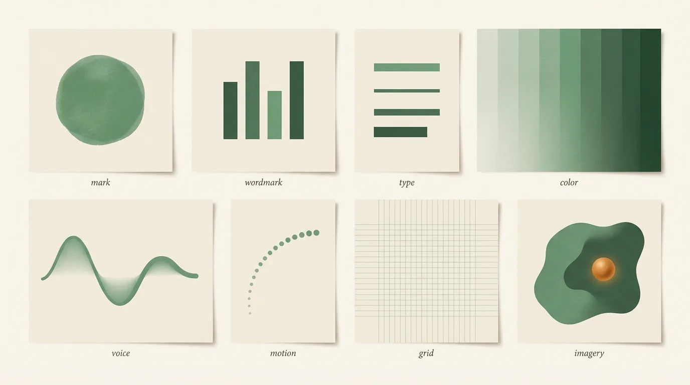
Abstract, monogram, or pictorial. Monochrome-safe. Legible at 16px favicon. Four variants (primary, inverse, single-colour, favicon).
Custom letterforms or carefully tuned type. Works with and without the mark. Fixed kerning baked into a hand-tuned SVG.
Display + body + mono + accent pairing. Modular scale. Variable-font governance. Fallback stack. Never more than four faces.
Semantic tokens (primary, secondary, accent, success, error). Light + dark mode parity. WCAG AA verified on every pairing.
Tone rules, banned vocabulary, example sentences, banned phrases. Ships as a writing critique tool, not just a guide.
Easing curves, duration tokens, signature transitions, reduced-motion fallback. Ships as CSS tokens + Framer Motion config.
Responsive grid, spacing scale, vertical rhythm, breakpoint behaviour. Identical in Figma and in Tailwind.
Photography treatment, illustration style, icon family geometry, aspect ratios, usage bounds. The one most brands skip.
Identity design is one phrase that means three different jobs. Misreading which one you're in is the fastest way to overpay.
Naming a new company is not the same job as refreshing a five-year-old brand. Rebranding at a pivot is not the same job as evolving through a growth stage. The shapes look similar from the outside; the work underneath is different.
You have an idea, a team, no brand. The work is 60% naming and positioning, 40% identity. Domain screening, trademark opinions, and voice come before the logo. Get this wrong and you rebrand in 18 months, one of the most expensive sequences in startup life.
New market, new audience, new category, or a merger. Positioning has shifted fundamentally and the existing identity is actively wrong. 40% strategy, 60% design. The hard part is brand equity, some still works, most doesn't, and misjudging which is which costs year-one revenue.
Positioning is right. Execution is dated. Type is showing its age, colour doesn't handle dark mode, brand has drifted across surfaces. 20% strategy, 80% craft. Evolution preserves equity on purpose, the logo gets sharpened, not redrawn. Customers don't notice anything changed. Everything improves.
We'll tell you which moment you're in on the audit call, and which one you think you're in. They're often different.
Voice isn't just what you write. It's what the typography whispers at the reader before a word gets read.
The animation below shows three typefaces pairing into a single brand voice, the actual construction, in 14 seconds.
Remove the logo from most well-branded sites and the brand is still recognisable. Remove the type and it falls apart.
Three rules every type system we ship obeys. UX Collective editors have been writing about modular scales for a decade for the same reason.
Display, body, mono, accent. That's the ceiling. Every additional face doubles the system's cognitive load and halves its recognisability.
Most brands with five faces have three accidents and two decisions.
Type sizes follow a mathematical ratio, major third, perfect fourth, golden. No arbitrary 23.5px. Every step is derivable.
Your engineers can extend the scale without asking a designer.
Almost every SaaS site ships grotesk + mono and calls it done. Adding a single italic serif, used on one or two emphasised words per heading, breaks every template that ever shipped.
It's the cheapest distinct-voice move in identity design.
A palette says "here are the brand colours." A system says when each one gets used, why, how it behaves in dark mode, and how it passes WCAG.
The difference is measured in how the site looks at month twelve.
Tokens are named by what they do, primary, accent, success, error, muted, not by what they are (moss-500, amber-700). Engineers pick tokens by intent.
A rebrand ships by swapping the underlying values, not by rewriting 10,000 component references.
Every brand hue ships with 7-9 lightness stops: 50, 100, 200, 300, 500, 600, 700, 900. Mathematical relationships in OKLCH, never eyeballed.
The 500 is the "brand" shade; the ramp handles every other context.
Every semantic pairing, text-on-primary, text-on-surface, focus-on-bg, passes WCAG 2.2 AA in both light and dark themes.
Dark mode isn't an inverted palette. It's a second ramp tuned for perceived weight at dark-surface viewing.
--moss-500: #6fa37a;   /* brand primary */
--moss-600: #3f6b54;   /* brand primary-hover */
--moss-700: #24453a;   /* brand primary-pressed */
--amber-500: #cd8a4b;  /* accent / launch moments */

/* semantic \u2014 what engineers actually use */
--color-text-primary:   var(--ink-0);
--color-text-on-accent: var(--moss-50);
--color-bg-surface:     var(--paper);
--color-border-subtle:  rgba(111, 163, 122, 0.15);
--color-focus-ring: var(--amber-500);The easing curve on your CTA button, the duration of a modal reveal, the overshoot on a card hover, these are brand decisions almost nobody makes on purpose.
We ship motion as tokens alongside colour and type, on the same handoff.
cubic-bezier(.2, .7, .2, 1)
Confident, not bouncy. Used on every transition. Two secondary curves for very specific cases.
120ms / 240ms / 400ms
Micro (hover), macro (modal), reveal (scroll-triggered). Four is too many; two is not enough.
40ms stagger, max 8 items
Content reveals feel orchestrated, not coded. Past 8 items the stagger becomes a delay; we don't stagger past that.
@media (prefers-reduced-motion)
Every motion token has a zero-motion fallback. 16% of users prefer it; we ship for them on day one.
Brand book without a design system gets ignored by month three. Design system without a brand book gets misunderstood by the next designer you hire.
Ship both. They refer to each other.
40-80 page PDF. What the brand is, who it's for, how to use the marks, where the voice comes from, the story behind each decision. Read by humans, hiring-forward, stakeholder-safe.
Code your engineers deploy. Tailwind config, CSS custom properties, Figma library, Framer Motion config, icon SVGs, logo variants. One source of truth. Changes propagate.
"The book persuades. The system ships. Neither works alone."
Every identity engagement, audit, evolution, full system, or naming, runs through the same five phases. Cadence is fixed; depth varies by tier.
Audit existing assets, interview founders, map audience, define positioning. Output: a one-page brief everyone signs.
Two or three distinct identity directions. Mark + wordmark + type + colour explorations. Pick one. Refine in the open. Wellness, food and craft brands usually brief the earthy editorial look; our organic earthy style guide shows the palette and type pairing we start from.
Component-by-component: type, colour ramps, voice, motion, grid, imagery rules, icon family. Weekly Loom reviews.
Figma library + Tailwind preset + CSS custom properties + Framer Motion config + SVG variants. Engineering deploys on day one.
Brand book PDF, launch assets, 30-day support window. Optional retainer for governance + edge cases as you scale.
Each shape has a different scope, timeline, and deliverable set. Pick the one that matches the moment you're in.
We confirm fit on the intro call and send a scoped quote within 48 hours.
Component inventory, consistency score, drift analysis, repositioning recommendation. Prioritized plan with effort + impact scoring. Deliverable is yours whether you engage us for the build or not.
Refined mark, updated type and colour system, voice sharpened, motion added. Tokens shipped to engineering. Equity preserved on purpose, customers don't notice anything changed; everything improves.
Complete identity, all 8 components. Guidelines + Figma library + Tailwind config + motion tokens + icon family. The system your engineers deploy on day one.
Naming exploration, domain availability checks, trademark screening with partner attorneys, plus the full identity system. For new ventures and major category pivots.
Quotes sent within 48 hours of an intro call. Trademark attorney fees on the naming tier are billed at cost, per mark per jurisdiction.
Identity work is high-trust. These are the proofs that come before the brief.
"Nine years of shipping. Two thousand brands. Fifty-plus people. Identity work is the highest-trust thing we do, we treat it that way."





Brand identity scope shifted three ways in 2026: AI image tools flooded the cheap end of the logo market, design tokens became the expected handoff artifact instead of a static PDF style guide, and brand books migrated from print decks to live Figma libraries that engineering pulls into a token pipeline on day one.
The token format itself is no longer agency-specific. W3C's Design Tokens Community Group draft is now backed by Figma, Adobe, Microsoft, and Google, and the JSON schema is stable enough that Figma Variables exports straight into Style Dictionary or Tailwind config without translation. Anyone still shipping a PDF brand book in 2026 is creating a second source of truth that drifts within one sprint.
The mark itself matters less than how it lives in product. On the Emani rebuild the wordmark took two weeks; the token system, motion grammar, and component library took the other ten. The artifact that survives is the system, not the logo file. Tools like brand.dev now auto-scrape a brand's living surfaces, which only works if your identity is engineered as data, not as image.
What this means for your project: when you brief a brand identity engagement in 2026, ask for the token-export format and the Figma library handoff up front. If the studio's deliverable is a PDF guideline and a logo zip, you will pay twice, once for the brand, once again the first time engineering rebuilds it as code.
Related reading + work: See our brand book versus design system breakdown, the Emani identity-to-Plus rebuild, and our logo design and UI/UX design pages for adjacent work.
Four of the free tools our identity team keeps open during discovery, browser-only, no signup.
What's in the system, what it costs, the book-vs-system distinction, rebrand-vs-evolve, naming and trademark scope, and how we measure whether the identity worked.
Eight components: logomark, wordmark, type system, colour ramp, voice, motion system, grid and layout, imagery and iconography. We ship all eight as production-ready tokens, a Figma library, a Tailwind config, a CSS token file, a Framer Motion config, a voice guide, and PDF guidelines. A system your engineers can deploy the same day, not a PDF in Dropbox.
Pricing is scoped to the engagement shape. Audit: 2 weeks. Evolution: 6-8 weeks. Full system: 10-14 weeks. Naming + full system: 14-18 weeks. Book a 30-minute intro call and we'll send a scoped quote within 48 hours. Scope moves price, not the discovery conversation.
Book documents in English. System enforces in code. Book without system gets ignored by month three; system without book gets misunderstood by the next designer. We ship both and they refer to each other.
Rebrand when positioning has fundamentally changed (market, category, audience) or when current identity is actively hurting perception. Evolve when positioning is right but execution is dated. Rebrands cost 2 to 3× more and lose equity. We'll tell you which you actually need on the audit call.
Yes, as part of the naming + identity tier. 40-80 candidates across four categories, narrowed to 8-12 for domain availability, then 3-5 for USPTO + EUIPO trademark screening. Partner attorneys handle the legal opinion. Final pick is yours.
Three measurements at launch + 90 days post. Aided recall (audience recognises and correctly attributes). Consistency audit (system followed across surfaces). Conversion impact (did the flagship page move its named metric). No vanity; all three are testable.
A 30-minute intro call to diagnose the moment you're in, audit, evolve, full system, or naming + identity.
You leave with a clear recommendation. We follow up with a scoped quote within 48 hours.
No sales pitch · we'll diagnose your moment honestly · scoped quote inside 48 hours
Published reviews from our Fiverr profile, reproduced word for word. 397 public reviews across 4 gigs, from clients in 36 countries. Read them all on Fiverr.
I’ve worked with several developers over the years, but this project stood out because of the level of investigation and problem solving involved. What impressed me most was the willingness to understand the platform's logic before making changes. I would absolutely recommend working with them.
I think I gave the team a pretty big challenge, and I’m really happy with how everything’s turning out. They’ve been easy to work with, communication has been great, and they’ve been willing to make changes whenever I’ve asked. Looking forward to continuing the project.
Working with this team was a fantastic experience. The website turned out exactly how I envisioned, and every feature was implemented with great attention to detail. The final result looks clean, modern, and performs really well. I truly appreciate the professionalism and would definitely work together again on future updates. Highly recommended!
very very best team in the world, they are very confidence person they told and know everything about the project they understand me fast and know exactly what they want to make
The part I appreciated most was how every decision was explained from a business perspective rather than just a design perspective. The site feels polished, easy to navigate, and genuinely reflects the premium image we wanted for our laptop brand. Highly recommended for full stack website!!
Very good result we are happy with the look of the new website and its functionality, definitely gonaa work again with them on our future projects. The team is very good at communicating and created a chat where we could all stay in touch along the project.
Reviews are reproduced as published on Fiverr, captured 2026-08-03. Fiverr shows the buyer's username and country publicly; no other client detail is used here.





115 people across five studios in New York, Delhi, London, Sydney and Lucknow, shipping ecommerce, web, software and mobile work for founder-led brands. Senior engineers only, no account-manager relay, and the same team from kickoff to launch.
Published · Last updated .

Pinch, scroll or double-tap to zoom · drag to pan
Where should we send the proposal?
Please enter your name and a valid email.
Any faster way to reach you? Optional.
Please fill in the one you picked.